library(data.table)
library(ggplot2)
library(parallel)

get_data <- function(
    N = 1000
){

  d <- data.table(i = 1:N)
  d[, trt := rep(0:1, each = N/2)]
  d[, sev := rnorm(N, 0, 1) ]

  d[trt == 0, p_ae := plogis(qlogis(0.04) + 0.4 * sev)]
  d[trt == 1, p_ae := plogis(qlogis(0.40) + 0.4 * sev)]

  d[, discont := rbinom(.N, 1, p_ae)]

  d[trt == 0, p_y := plogis(qlogis(0.20) - 0.3 * sev)]
  d[trt == 1, p_y := plogis(qlogis(0.40) - 0.3 * sev)]

  d[, y := rbinom(.N, 1, p_y)]

  d
}Limitations of per-protocol analyses
Patients in RCTs that discontinue before the endpoint often have poorer prognosis than those who continue treatment. Additionally, discontinuation is more common in the treatments that create more side effects or have less clear benefit.
The traditional per-protocol analyses will exclude those patients that are not completers and that deviate in some unacceptable way from the protocol (e.g. early discontinuation of treatment) and then run the primary analysis unchanged. That is, the comparison groups are defined in part by post randomisation events that are influenced by treatment group status and other factors. This can be problematic in that it violates the randomisation principle, the treatment groups can become unbalanced in either known or unknown covariates, selection bias can arise, effect estimates may be biased and external validity threatened, [1]. The following example illustrates this.
Compare a new antihypertensive (A) to a standard treatment (B) for lowering blood pressure in patients with existing hypertension in an RCT. At 6-months patients are assessed to be either still hypertensive (0) or no longer hypertensive (1). One thousands patients are randomised, 500 to each arm.
It is common for trials to show differential adherence by study group. Here, assume that A causes more side effects than B and at 3 months, 20% of patients stop taking A due to side effects and 4% stop taking B for a side effect intercurrent event. We interpret this as a protocol deviation (although who knows whether this would actually be consider to be a protocol deviation in reality). Additionally, assume that the patients who experience side effects (and therefore would dropout of the traditional PP analysis) tend to have more severe hypertension and would have shown less improvement in blood pressure status irrespective of the treatment they received.
The traditional per-protocol analysis excludes those that deviate from the protocol and we would therefore have around 400 patients in A and 480 patients in B.
Finally assume that the true percentage that are no longer hypertensive at 6 months is 40% and 20% in group A and B respectively.
Below is a simulation of the assumed data generation process.
Simulating this data generation process a large number of times, the ITT estimate along with the PP estimates can be computed to gain some insight of their long-run properties.
m_res <- do.call(rbind, mclapply(1:1e4, FUN = function(i){
  d <- get_data()

  # ITT analysis
  f1 <- glm(y ~ trt, data = d, family = binomial())
  rd_f1 <- diff(predict(f1, type = "response", newdata = data.table(trt = 0:1)))

  # Traditional PP analysis
  f2 <- glm(y ~ trt, data = d[discont == 0], family = binomial())
  rd_f2 <- diff(predict(f2, type = "response", newdata = data.table(trt = 0:1)))

  # G-comp - weights per the full sample
  f3 <- glm(y ~ trt + sev, data = d[discont == 0], family = binomial())

  d_trt_1 <- copy(d)
  d_trt_1[, trt := 1]
  d_trt_0 <- copy(d)
  d_trt_0[, trt := 0]

  f3_eta_trt_1 <- predict(f3, newdata = d_trt_1)
  f3_eta_trt_0 <- predict(f3, newdata = d_trt_0)

  rd_f3 <- plogis(mean(f3_eta_trt_1))  - plogis(mean(f3_eta_trt_0))

  c(rd_f1, rd_f2, rd_f3)

}, mc.cores = 6))
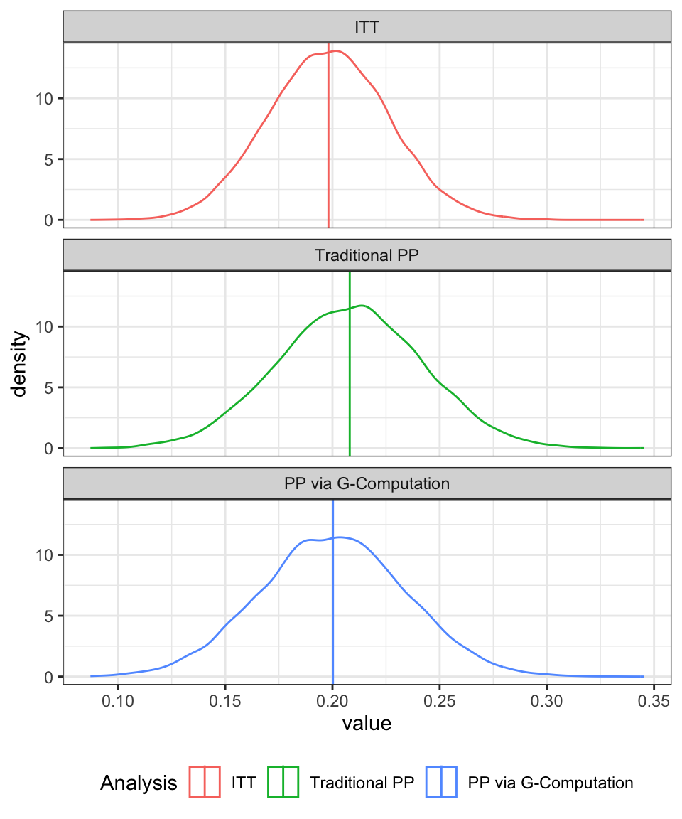
Figure 1 shows the results. Specifically, the distribution of the estimated treatment effect (risk difference) which is known to have a true value of 0.2 in favour of the new drug (A).
Under the ITT analysis (where we ignore the fact that the ICE occurred and simply proceed to analyse all the data, irrespective of whether the ICE occurred or not) the long-run expected value for the MLE estimate of the treatment effect aligns with the true value of 0.2.
However, in the traditional PP analysis, we drop those patients for whom the protocol deviation applies. We fit the same model as was used in the ITT analysis to the remaining data. For this approach, we can see that the expected value for the MLE estimate is inflated.
The final plot shows the results from a revised approach to the per-protocol analysis where we:
- run the analysis assuming that the deviations are censored, i.e. we drop anyone that had the side effects
- add variables that are predictive of the ICE into the model
- for the entire data set make predictions of the outcome assuming that all patients are assigned to the standard treatment (A)
- repeat 3 for the patients assuming that all patients are assigned to the standard treatment (B)
- compute the treatment effect (risk difference) as the difference between the means of the predicted values each transformed back to the risk scale
This final approach is aligned with a G-computation perspective and gives results similar to those that would be produced from an inverse probability of censoring weighting scheme. In both cases, we are effectively, producing a re-weighted estimate of the effect, but going about it in slightly different ways.
Under this revised per-protocol approach, we once again produce an estimate of the treatment effect that has a expected value close to the known true value of 0.2. Clearly, this is a very much simplified and synthetic example, but it is only intended to give an introduction.
d_fig <- data.table(m_res)
names(d_fig) <- c("itt", "pp_1", "pp_2")
d_fig <- melt(d_fig, measure.vars = names(d_fig))

d_fig[variable == "itt", variable := "ITT"]
d_fig[variable == "pp_1", variable := "Traditional PP"]
d_fig[variable == "pp_2", variable := "PP via G-Computation"]
d_fig[, variable := factor(variable, levels = c(
  "ITT", "Traditional PP", "PP via G-Computation"
))]

ggplot(d_fig, aes(x = value, group = variable, col = variable)) +
  geom_density() +
  geom_vline(data = d_fig[, mean(value), keyby = variable],
             aes(xintercept = V1, col = variable)) +
  scale_color_discrete("Analysis") +
  theme_bw() +
  theme(legend.position = "bottom") +
  facet_wrap(~variable, ncol  = 1)
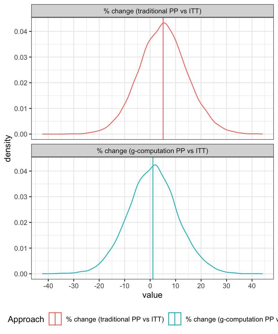
The difference between the two per-protocol approaches can be emphasised by looking at the distribution of the percentage differences between the ITT effect and the PP effects as shown in Figure 2. For the traditional approach, the treatment effect is, on average, about 5% higher than it should be whereas under the revised approach, the PP approach aligns fairly well with the ITT estimate (with both being aligned with the true value).
d_fig <- data.table(m_res)
names(d_fig) <- c("itt", "pp_1", "pp_2")
d_fig[, pct_diff_1 := 100 * (pp_1 - itt)/itt]
d_fig[, pct_diff_2 := 100 * (pp_2 - itt)/itt]

d_fig <- d_fig[, .(pct_diff_1, pct_diff_2)]
d_fig <- melt(d_fig, measure.vars = names(d_fig))

d_fig[variable == "pct_diff_1", variable := "% change (traditional PP vs ITT)"]
d_fig[variable == "pct_diff_2", variable := "% change (g-computation PP vs ITT)"]

d_fig[, variable := factor(variable, levels = c(
  "% change (traditional PP vs ITT)",
  "% change (g-computation PP vs ITT)"
))]


ggplot(d_fig, aes(x = value, group = variable, col = variable)) +
  geom_density() +
  geom_vline(data = d_fig[, mean(value), keyby = variable],
             aes(xintercept = V1, col = variable)) +
  scale_color_discrete("Approach") +
  scale_x_continuous(breaks = seq(-40, 40, by = 10)) +
  theme_bw() +
  theme(legend.position = "bottom") +
  facet_wrap(~variable, ncol = 1)